Wit and Irony, Ease and Sprezzatura with Jim Stirling at a Mid-Point in his Sadly Cut-Short Career
John Maule McKean, edited by Renato Bocchi
Versione italiana
||| Abstract |||
In 1979, the Scottish critic John M. McKean, who was active at the Architectural Association in London at the time, published a two-part profile of James Stirling in the weekly journal “Building Design”. The article was based on an interview conducted at the studio that Stirling shared with his partner, Michael Wilford, during a pivotal phase of his internationally recognised career. Nearly fifty years later, McKean kindly allowed us to publish an abridged version of the article, which vividly captures Stirling’s ironic essence and that of his architecture.
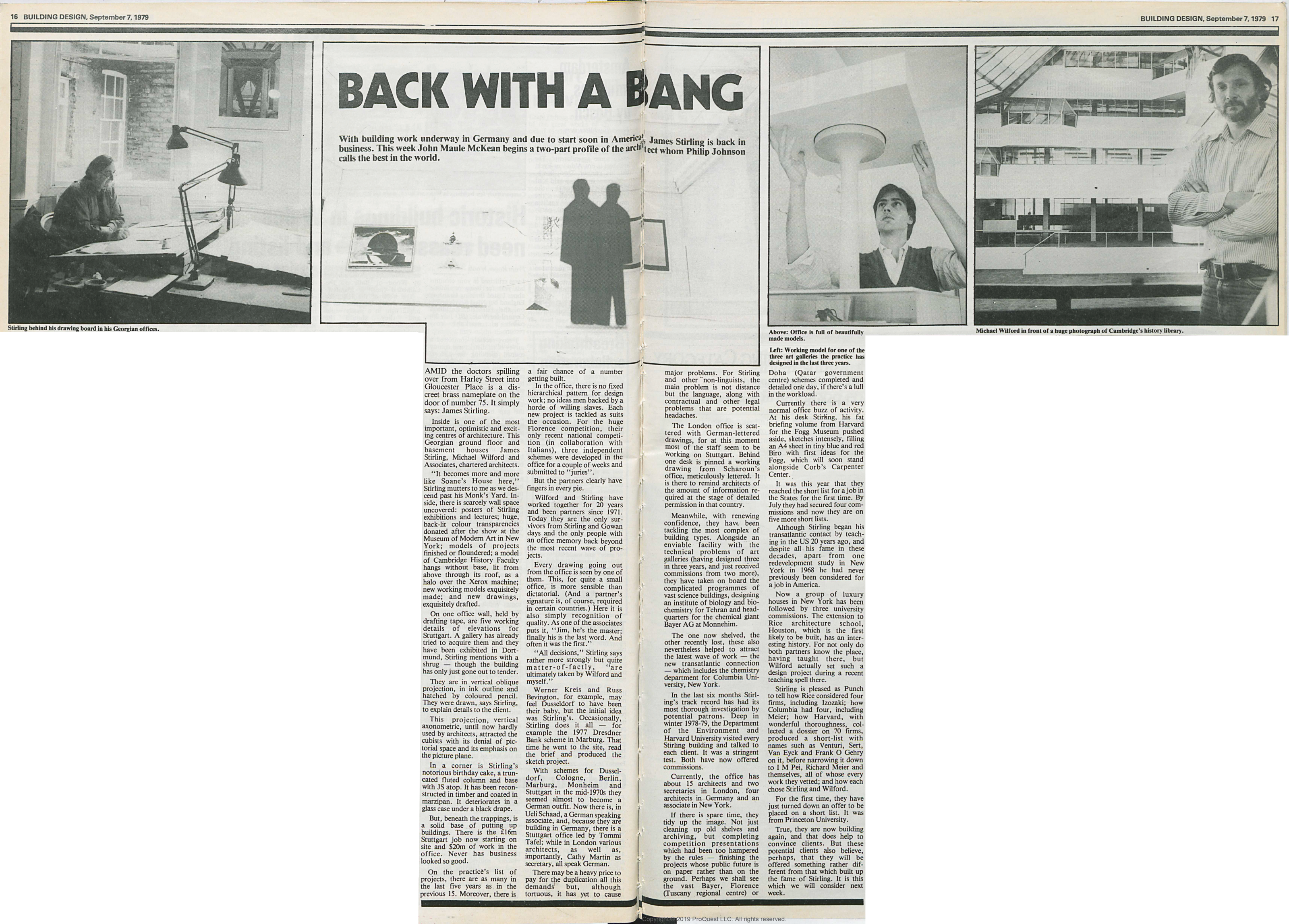
In August 1979, as James Stirling’s career engaged a new gear, with renewed confidence Stirling invited me in, to discusses the current, and so far almost unknown, maniera moderna of their recent years. Thus, nearly half a century ago, my long profile filled two issues of the London weekly review, Building Design. I have tried over later years to describe sprezzatura to the English, as “trying very hard to make it look as if you’re not trying at all”. James Stirling was a master of this. Now in 2026, focusing on Stirling’s wit and irony, his ease and sprezzatura, I offer excerpts from my historic report from a distant front line.
- * * *
From Stirling’s occasional public utterances to the studio’s new notepaper which now [in 1979] abandons solid, ‘modern’ sans simplicity; replacing it with an elegant, classic, engraved serif face, set centrally, as if on the paper of a tasteful banker or cardiologist, as from drawings to words, and of course in their architecture, all is sharpened by its well-honed sense of irony.
– Who else, even were Ben Jonson to make exquisite photo-realist painted images of their details, would buy from exhibition this superbly coloured airbrush wizardry and then hang it next to the huge photo on which it was based, amidst beautifully mounted design drawings of the same building?
– Who else, come to that, making drawings presentable for a show (at the RIBA Heinz Gallery, 1974) would have them titled in antique letterpress and window mounted for all the world as if dusty from the British Museum Print Room?
– Who else (a last glimpse) would publish Le Corbusier’s Buenos Aires five towers, sans caption, as if part of their own Siemens AC scheme?
And they enjoy it all quite openly. “It becomes more and more like Soane’s House here”, Stirling mutters to me as we descend past his Monk’s Yard; past huge colour transparencies, kindly donated after a show at the Museum of Modern Art and, with innocent pleasure, brightly back-lit when visitors are expected. Amidst models forming a memory palace, the Cambridge History Faculty hangs high without any base (to recall the worm’s eye axos he stole from Choisy and made his own), lit through its roof, as a halo over the Xerox machine. On one office wall, held by draughting tape and as if chance, are five elevation details for Stuttgart. A gallery has already tried to acquire them, Stirling mentions with a shrug—for the building has only just gone out to tender.
[… ]
But it is not so simple: these drawings, I learn, are just back from exhibition in Dortmund. In vertical oblique projection, in ink outline and beautifully hatched coloured pencil, they are exquisite complex images. Drawn, says Stirling with poker face, to explain details to the client. This ‘vertical axonometic', a projection until now hardly used by architects, attracted the cubists with its denial of pictorial space and its emphasis on the picture plane. "Happily”, says Stirling interrupting my thought, “the clients here are architects who enjoy reading interesting drawings”. Living with the Midas touch is an art no others can play so well. It is bad enough, after all, to have Philip Johnson dub you the leading architect of your generation in the world.
So the mythologies have sensibly reinforcing cores. Stirling’s famed birthday cake, a truncated fluted column and base with JS atop, has been reconstructed in timber and coated in marzipan by a specialist. It deteriorates quietly in a glass case under a black drape. Stirling’s famed lunch with the Queen—when, unrecognised, he was forced to retreat from Buckingham Palace and phone in a description of his blue shirt, blue cotton tie and so on – is reconstructed daily in his unchanging attire. When the Stuttgart foundation stone is laid by the German President and his cohorts in Baden Württemberg in a few weeks’ time, on September 6th 1979, it will cover a casket containing a blue shirt.
But, beneath all this, there is a real base; and without it, the style and wit would be brittle and thin. And it is this: they are putting up buildings. And projects finally start to multiply. For a practice so used to failed or aborted—if critically acclaimed—projects, this is a real tonic. Parallel, however, and surely related, the designs of these last few years have offered a radically different view of architecture from that on which Stirling (with and then without Gowan) achieved early international acclaim.
One of the tiny clutch of critical appraisals the office has received recently (by Craig Hodgetts in Design Quarterly (1976) claimed Le Corbusier’s Philips Pavillion at Brussels as a model for Stirling in the 1960s. Knowing Philips to be almost entirely the work of Xenakis, inside atelier Corbu, set me inevitably speculating on the parentage of 'Stirling' schemes. Stirling and Michael Wilford have worked together for 20 years, and been partners since 1971. Today not only the sole survivors from Stirling & Gowan days, they are the only ones left with an office memory back beyond the most recent wave of projects and they are closely involved in every project. As one of the associates said to me, “Jim, he’s the master; finally his is the last word. And often it was the first”. “All decisions”, Stirling noted rather more strongly, but quite matter-of-factly, “are ultimately taken by Michael and myself”.
Deep in last winter, 1978/9, both the British Government (DOE) and Harvard University, visited every Stirling building and talked to each client. It was a stringent test. Both have now offered commissions. When his Tate Gallery appointment was recently announced, Stirling seriously considered legal action on reading a snide note about his leaking History Faculty at Cambridge. It has not leaked for eight years. Yet that is all we can think of to say about the best-known architect in Europe and America today, who just happens to be British and finally chances to win a commission in his own country.
[...]
Today, Geist’s Passagen lies on a desk, a young woman looks at a book on Palladio’s Malcontenta. Mirrors, candelabra, scraps. On the wall in the partners’ office, the card of a much too young Corbu—“to Jim”—is dated 1965. And Stirling, at his desk opposite, with his fat briefing volume from Harvard pushed aside, sketches intensely; filling an A4 sheet in tiny blue and red biro with first ideas for the Fogg, their building which will soon stand alongside Corbu's own Carpenter Center.
Stirling now has more work than ever. To our shame, virtually none of it in Britain. He suggests that European, and now American, clients are more discerning. He means it, directly as well as ironically. Earlier in this year 1979, for the first time, they reached the short list for a job in the USA. By July they had secured four commissions; now; a month later, they are suddenly on five more short lists. For the first time, they have just turned down an offer to be placed on a short list. It was from Princeton University.
After the well-publicised Derby town centre and the vast Siemens competitions, both of which the office lost but where the extraordinarily fertile mind of Leon Krier first came to wider notice, there was the tiny contextualist gesture for St Andrews’ Arts Centre and the major Milton Keynes headquarters for Olivetti. Both of these also collapsed in 1971 for lack of financial will.
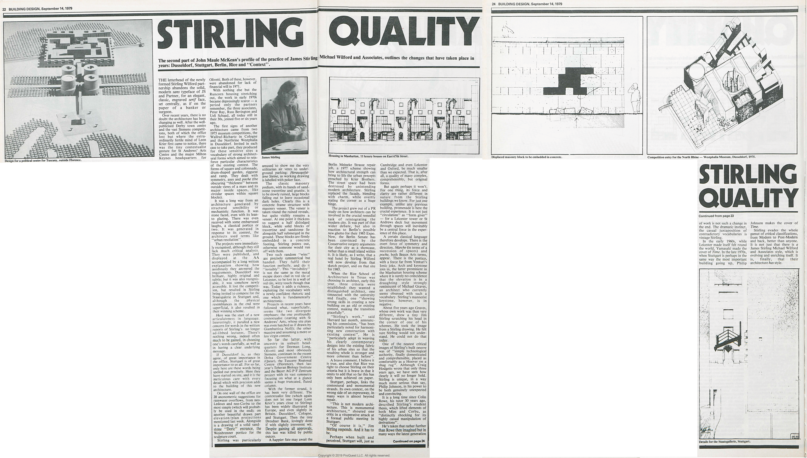
And with nothing else the early 1970s became depressingly thin—until two German museums invited them to compete in 1975. There, a new vocabulary of strong architectural forms aimed to reinforce particular characteristics of the site and context. We see the forms of square and colonnade, drum-shaped garden, ziggurat and ramp. We have come a long way from an architecture generated by structural sensibility or mechanistic function. The design for Dusseldorf was brilliant, highly original and subtle. It was also recognisable; somehow newly accessible. A winner. Although it lost the competition, it gave Stirling momentum to take the moral victory. For it resulted in their being invited to compete for, and then win, the Staatsgalerie in Stuttgart.
Here was the start of a new articulateness in language. Stuttgart is of great importance, for so far, only here, are these words being spelled out precisely. Here they have started on site, and it is the meticulous care with every detail, the precision, which adds to the building of this new architecture. Stirling is particularly amused to show me the very utilitarian air vents to underground parking: Herausgefallene Steine, as the working drawing is labelled with poker face. The classic, masonry podium, in its bands of sandstone, travertine and granite, is to become slightly ruin, large blocks having ‘fallen out’ to leave occasional dark holes. Clearly this is a concrete frame structure with masonry veneer. The veneer is taken round the ruined reveals, but quite visibly remains a veneer. At one point it thickens to suggest a half-dislodged block, while solid blocks of travertine and sandstone lie alongside, half submerged in the ground. (The Midas touch appears again: these blocks are firmly embedded in a concrete footing, Stirling quietly adds in my ear, otherwise someone would run off with them.) Then we notice that two such random “ruins” are precisely symmetrical but handed.
They fulfil their function perfectly; and do it ‘invisibly’. But this new ‘invisibility’ is not as the metal escape doors clad in red tile, to be lost in a wall of red tile, sharp ironic touch though that was, back then at Leicester. Today it adds a richness, exploiting the vocabulary with a newly confident rhetoric; and one which is fundamentally architectonic. Stirling’s recent, profoundly contextualist sensibility—begun with St. Andrews’ Arts, whose site plan was even hatched as if drawn by Giambattista Nolli in the mid 18th century – runs alongside an opposite sense of great mass and power, assuming a more or less virgin context.
So far this latter stream, from unbuilt headquarters for Dorman Long, Olivetti and, most obviously, Siemens, to the Doha Government Centre (Qatar), the Tuscany Regional Centre (Florence), Teheran‘s Biology Institute and the Bayer AG P F Zentrum project, this has yet to be exposed or discussed. Stirling holds back, unwilling for me to chase them further now. They will be revealing, when revealed more fully. But the former strand, the contextualist line (which again does not let one forget Leon Krier's years close to Stirling) has been widely illustrated. Dusseldorf, Cologne, Stuttgart, of course, and then the tiny Dresner Bank, lovingly done if with slightly irreverent wit. Despite gaining all approvals, this last was killed by public outcry.
[…]
When Rice was choosing its architect, early this year, three criteria were established: they wanted a distinguished architect, one connected with the university and, finally, one “showing strong skills in creating a new building on an old or existing context, making the transition gracefully”. “Stirling”, said Harvard last month, announcing his commission, is “particularly adept in weaving his clearly contemporary designs into the existing fabric of his urban sites so that the resulting whole is stronger and more coherent than before”. A brave comment. I believe it is precisely true, and also that Rice was right to choose Stirling on their criteria. And it's brave that Rice—like Harvard—omits to add that so far this has only been achieved on paper.
But if not yet built, this new emphasis has become widely acknowledged. The design of Dusseldorf’s Grabbe Platz, and the reintegration of the wasteland between the Cathedral, railway and river in Cologne were major original exercises. Although museum competitions generated them, the enclosure of art works was a relatively minor part of the urban restructuring proposed.
Stuttgart, perhaps, links the contextual and monumental strands. “This is not modern architecture! This is monumental architecture”, shouted Benisch in vituperative attack at a formal public meeting in Stuttgart. “Of course it is”, Jim Stirling responds. And it has to be. Is it Stirling’s lightly borne deep culture, his wit and irony which so infuriates Herr Benisch?
So now a certain classical language develops. There is the overt force of symmetry and direction; marche (in terms of a succession of spaces) and poché, both Beaux Arts terms, appear. There is the portico, with a force far from Venturi’s ionic ‘joke’. Arch and keystone join in—and it is surely no coincidence that one elevation is in a draughting style strongly reminiscent of Michael Graves, an architect who currently seems obsessed with such a vocabulary. Stirling’s mannerist keystone, however, sidesteps just enough into a negative. About five years ago, Graves (whose own work was then very different) drew a tiny Jim Stirling scratching his head in the corner of one of his schemes; he took the image from a Stirling (actually a Leon Krier) drawing. Graves told me then that he felt sure Stirling would not understand. He could not presume that today.
One of the neatest critical images of Stirling’s built oeuvre once was of “simple technological authority, finally domesticated and comprehensible, placed as comfortably as a Hoover on a shag rug”. Although Craig Hodgetts wrote that neat simile only three years ago, oh how clearly it will no longer hold! Stirling is unique, in a way much more serious than, say, Philip Johnson, in his power to be both genuinely unexpected and convincing.
It is a long time since Colin Rowe, his tutor 30 years ago, described Stirling’s student thesis, which lifted elements of both Mies and Corb, as “distinctly shocking for its highly casual manipulation of derivations …”. Sure, he’s taken that rather further than Rowe then imagined, but in many ways the latest generation of work is not such a change in the end. The dramatic instinct, the casual juxtaposition of contradictory vocabularies, this is vintage Stirling.
Jim Stirling in 1979 evades the whole gamut of critical classifications, from A to B and back again (or Modern to Post Modern and back post haste), better than anyone. It is not just that the work is evolving and enriching itself. It is, finally, that this architecture has style.
Abstract
In 1979, Scottish critic John M. McKean, then active at the Architectural Association in London, published a two-part profile of James Stirling in the weekly journal “Building Design”, based on an interview conducted at the studio Stirling shared with partner Michael Wilford during a pivotal phase of his career. Nearly fifty years later, McKean revisits that report, focusing on Stirling’s wit, irony, ease and sprezzatura. Excerpts trace the studio’s pervasive irony – from notepaper to exhibited drawings – the Stuttgart Staatsgalerie’s “ruined” masonry veneer and Herausgefallene Steine air vents, the Düsseldorf and Cologne museum competitions, and the new Harvard Fogg commission alongside Corbusier’s Carpenter Center. Anecdotes such as Stirling's marzipan birthday cake and his encounter with the Queen are also recalled, alongside the two strands of his recent work – contextualist and monumental – and his evasion of fixed classification between Modern and Post-Modern.
keywords | James Stirling; Sprezzatura; Neue Staatsgalerie Stuttgart; Postmodernism.
Per citare questo articolo / To cite this article: John Maule McKean, Wit and irony, ease and sprezzatura with Jim Stirling at a mid-point in his sadly cut-short career, “La Rivista di Engramma” n. 237, luglio 2026.
Per citare questo articolo / To cite this article: John Maule McKean, Wit and irony, ease and sprezzatura with Jim Stirling at a mid-point in his sadly cut-short career, “La Rivista di Engramma” n. 237, luglio 2026, pp. xx-yy | PDF dell’articolo